Game Art Assets
✦ ✦ ✦
Below are art assets that I've made for games projects. Click each image to view more!


Well Witches: Raven Familiar
✦ ✦ ✦
Overview
A showcase of the design process for the Raven Familiar in the game Well Witches. I was tasked to make both the concept art and the final asset to be implemented into the game.
Click above to view a more detailed process of the Raven Familiar. Click below to return to the previous page
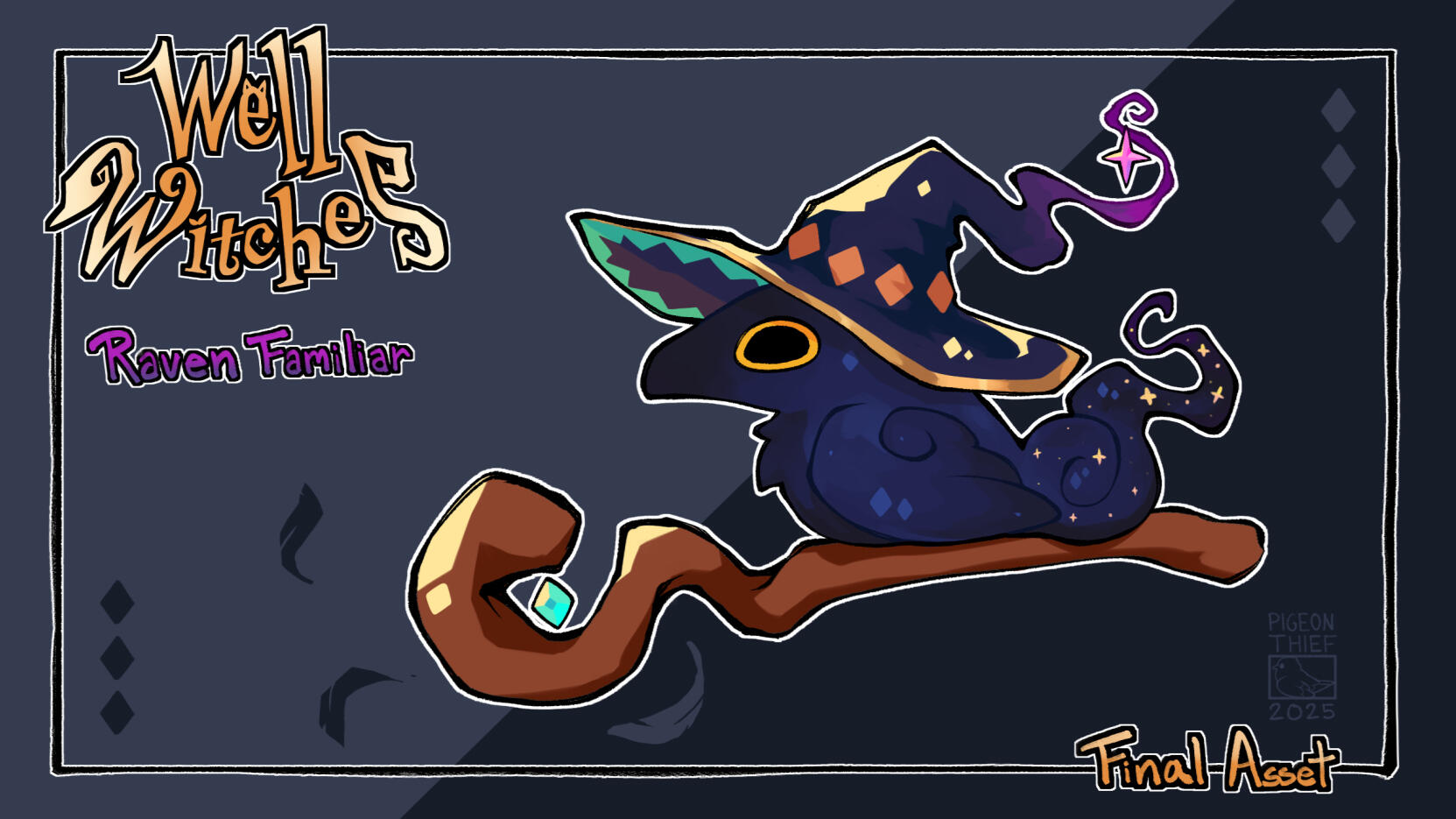
Final Concept and Game Asset

Early Concept Explorations
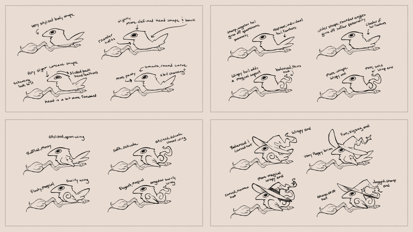
Focused Design Explorations; Body Shape, Tail Design, Wing Design, & Hat Concepts


Design Alterations to account for updated lore, & Finalizing Wing and Tail designs
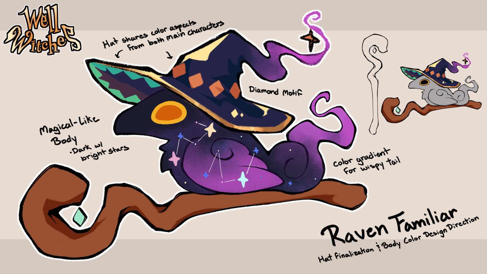
Almost there! Defining body design direction and finalizing hat design
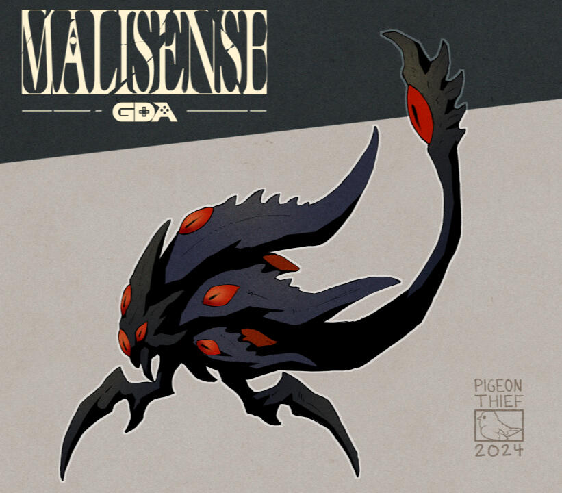
Malisense: Sight Beast
✦ ✦ ✦
Overview
A showcase of the design process for the Sight Beast in the game Malisense. I was tasked to make both the concept art and the final asset to be implemented into the game.
Click above to view a more detailed process of the Sight Beast. Click below to return to the previous page
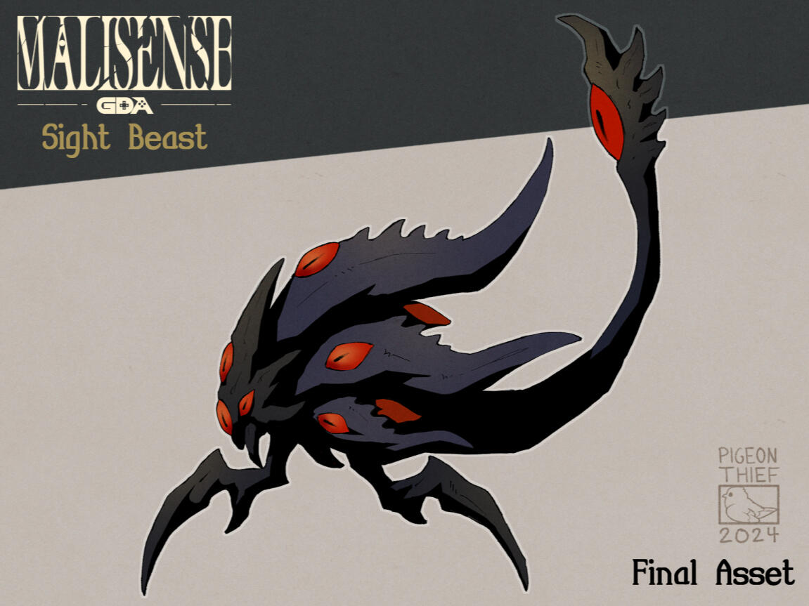
Final Concept and Game Asset
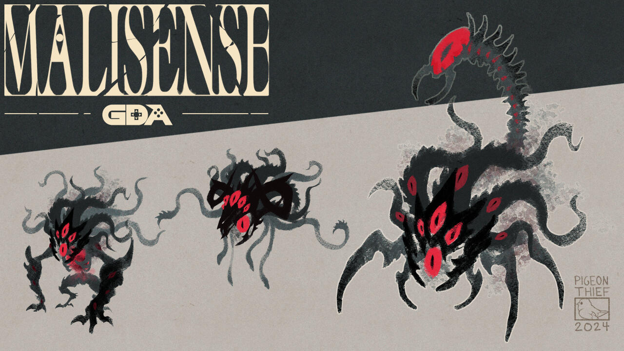
Early Silhouette-ish Concept Explorations

Focused Design Explorations & Refinement
Monster Boutique: Bat Monster
Overview
A showcase of the design process for the Bat Monster for the game prototype Monster Boutique. I was tasked to make both the concept art and the final asset to be implemented into the game.
Click above to view a more detailed process of the Bat Monster. Click below to return to the previous page
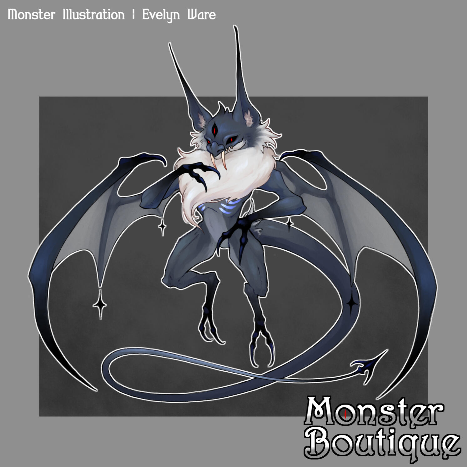
Final Concept and Game Asset


Final Clothing Game Assets

Early Concepts: Monster Portrait Explorations
Early Monster Concept Explorations
Re-Design Concepts

New Concept Design Process
Personal Illustations
✦ ✦ ✦
I grew up playing Pokemon throughout my childhood, and still do to this day. As a result, much of my personal works consist of Pokemon-related fanart. I also consider it the reason why I have such an interest in creature and monster designs.


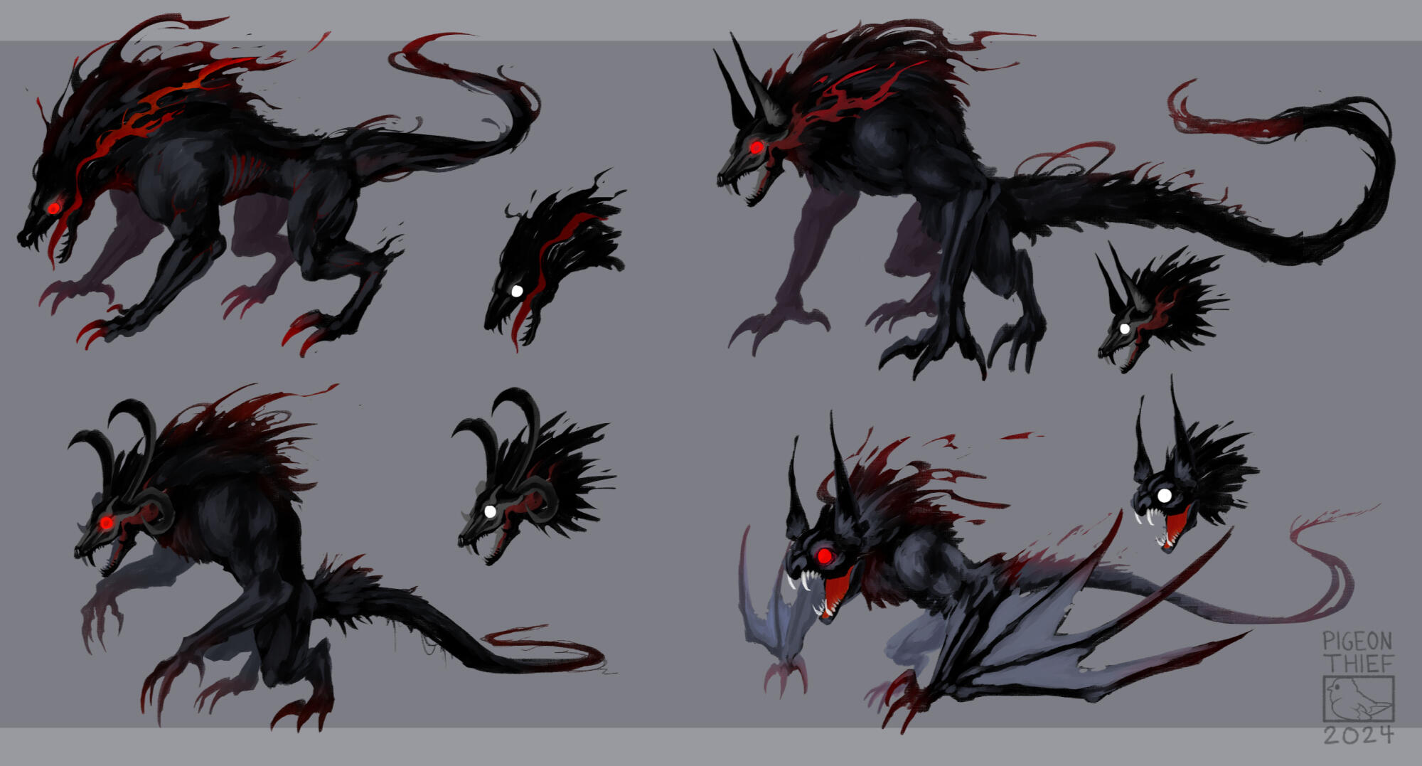
Personal Artworks
✦ ✦ ✦
Below are a few concept sheets of various creature designs. Some are from projects that I've worked on, hence the varying art styles.


3D Works
✦ ✦ ✦
While 3D modeling isn't my main focus, I do enjoy the occasional stylized modeling of creatures. Below are hand-painted models made by me.
Stylized Dragon Model


Fantasy Bat Model


Projects
✦ ✦ ✦
Below are the projects that I've worked on, many during my time as a student.
Page Still W.I.P.
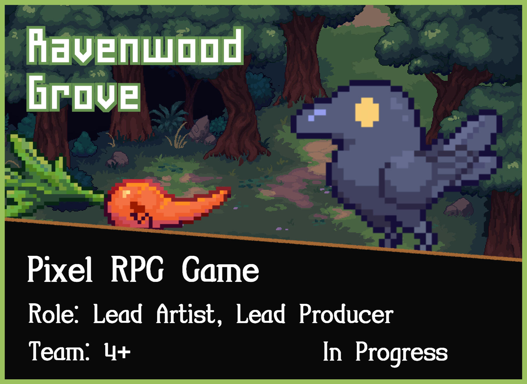
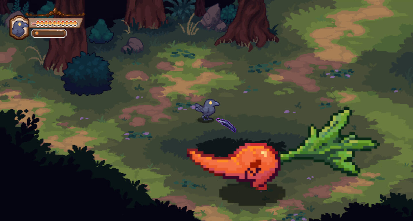
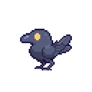
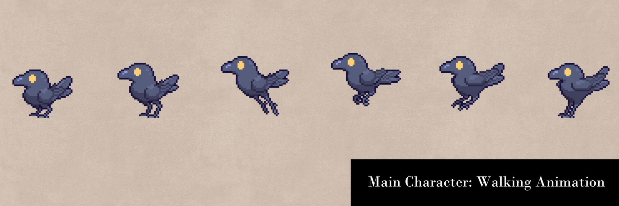
Ravenwood Grove
✦ ✦ ✦
Ravenwood Grove is currently in development and is my current capstone as a UCSC Game Design student. All art assets are created by me.
Animation Showcase
Main Character ✦
My goal for the walking animation is for the bird to look just like a crow hopping in real life. In order to achieve this, I spent several hours examining videos of crows playfully hopping around.
Full Showcase
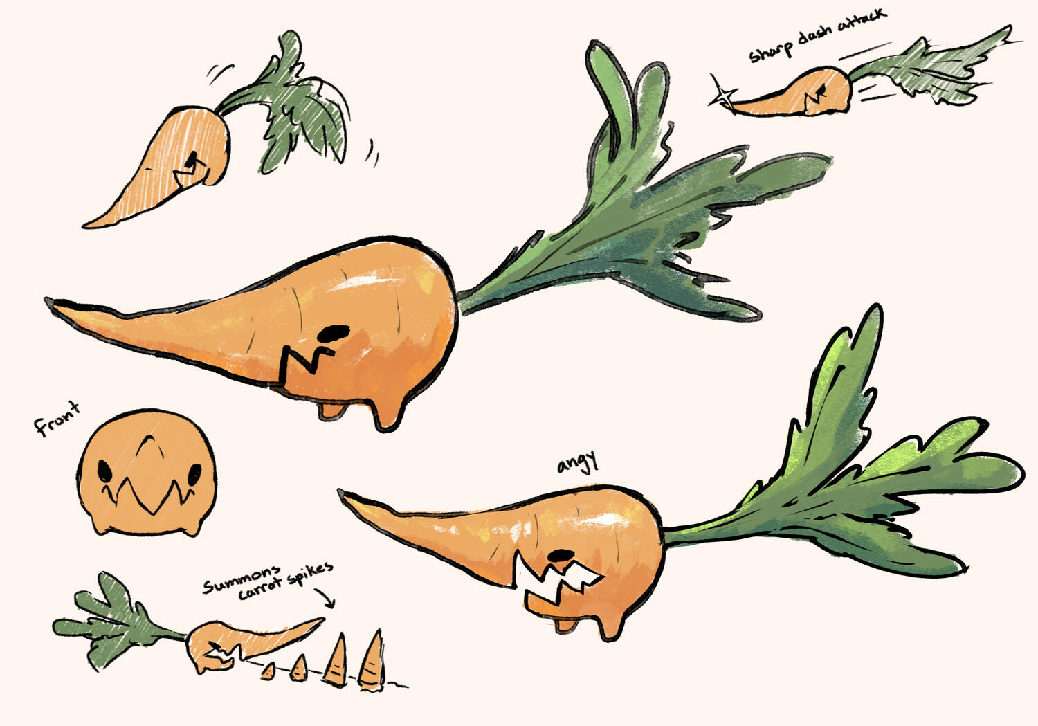
Carrot Enemy
The first enemy of our game. The design is simple, yet compelling.


Full Showcase
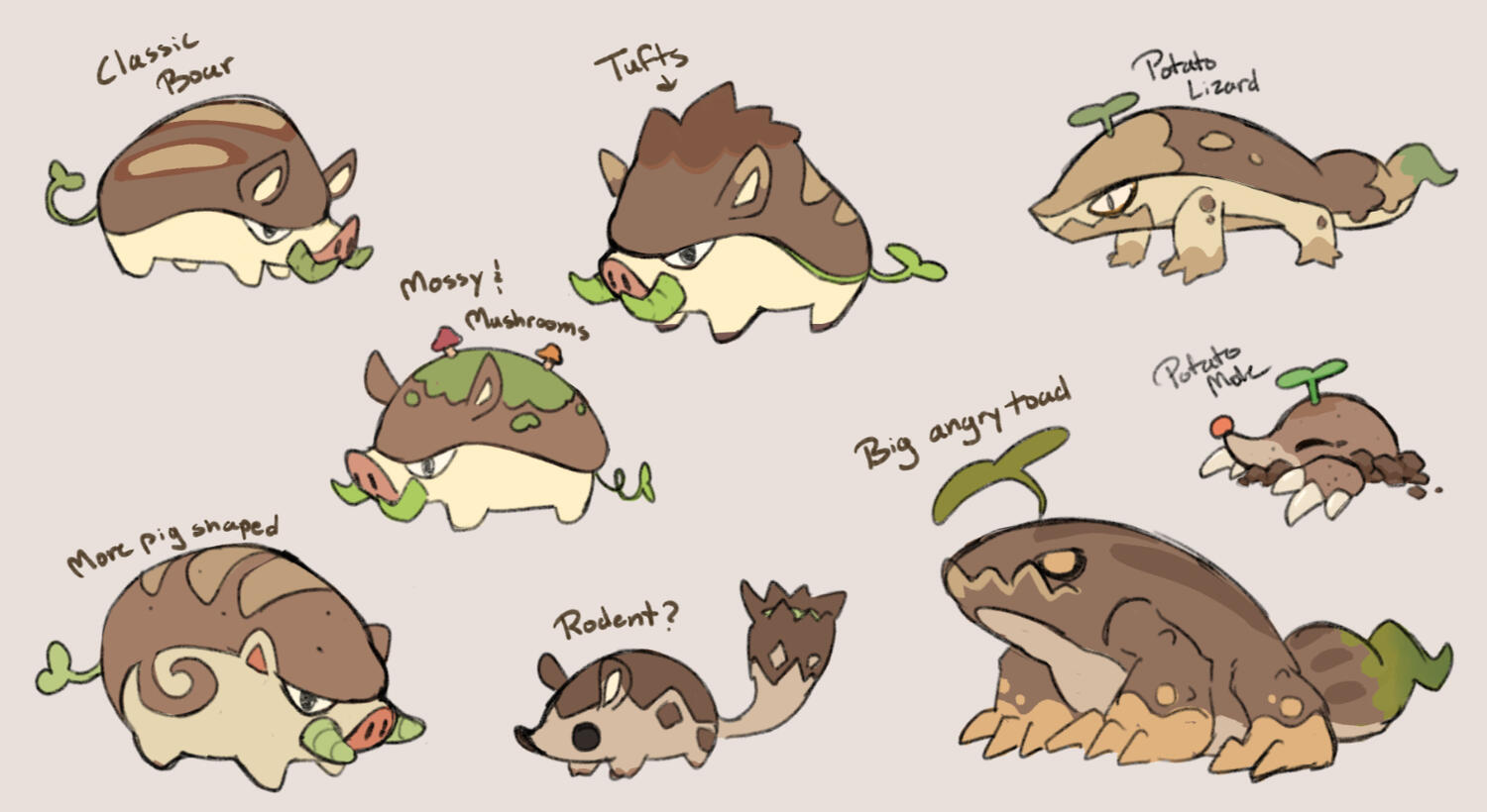
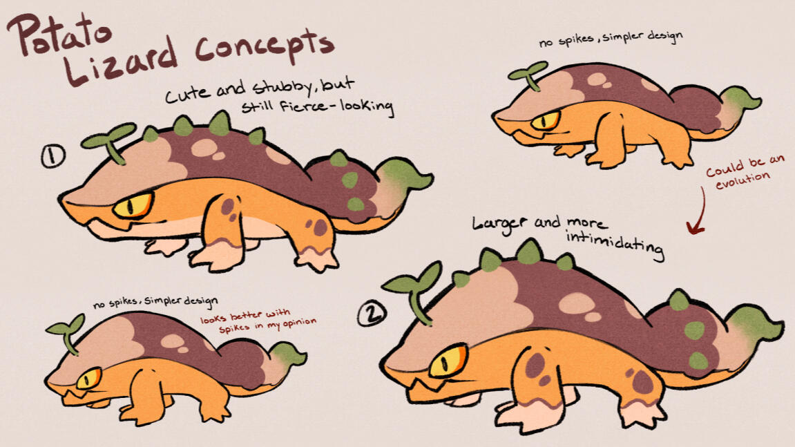
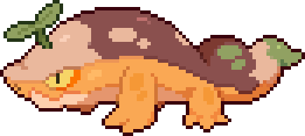
Potato Enemy ✦
Our second enemy of the game. Below are early concepts and focused concepts.
Malisense: Sight Beast
✦ ✦ ✦
Overview: Malisense is a game I worked on in a large team for GDA at UCSC. I created the concept art for the Sight Beast, as well as the finalized asset.

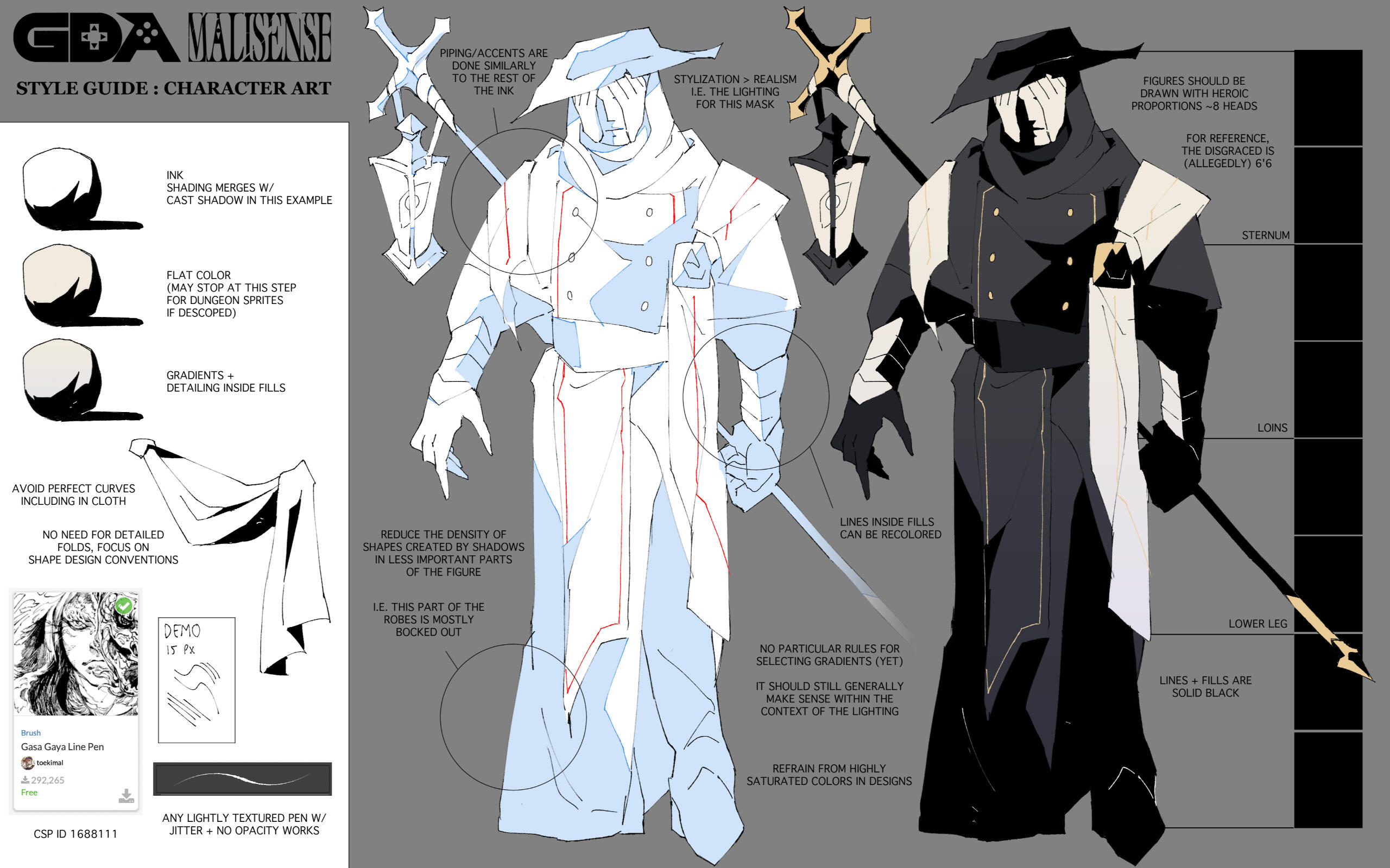
✦ Style Guide
Displayed is the style guide that the art department was given in order to guide us and achieve the desired art direction throughout this project.The main takeaways are utilizing the flat colors to create dramatic, but intentional solid shading. Highly saturated colors were to be used sparingly and with intent. Sharp, angular shapes and lines were favored over round ones in order to fit the dark, gothic horror theme of the game.
Early Concepts ✦
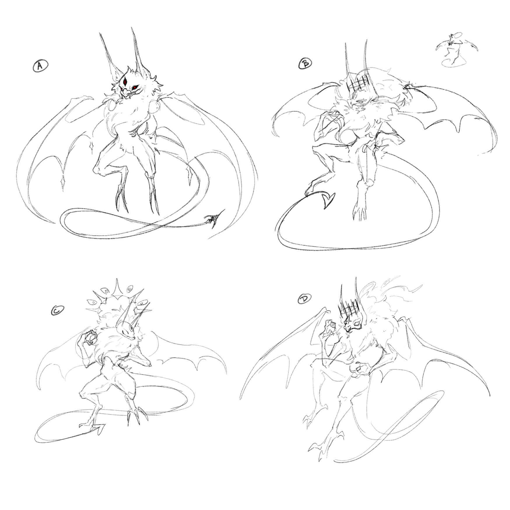
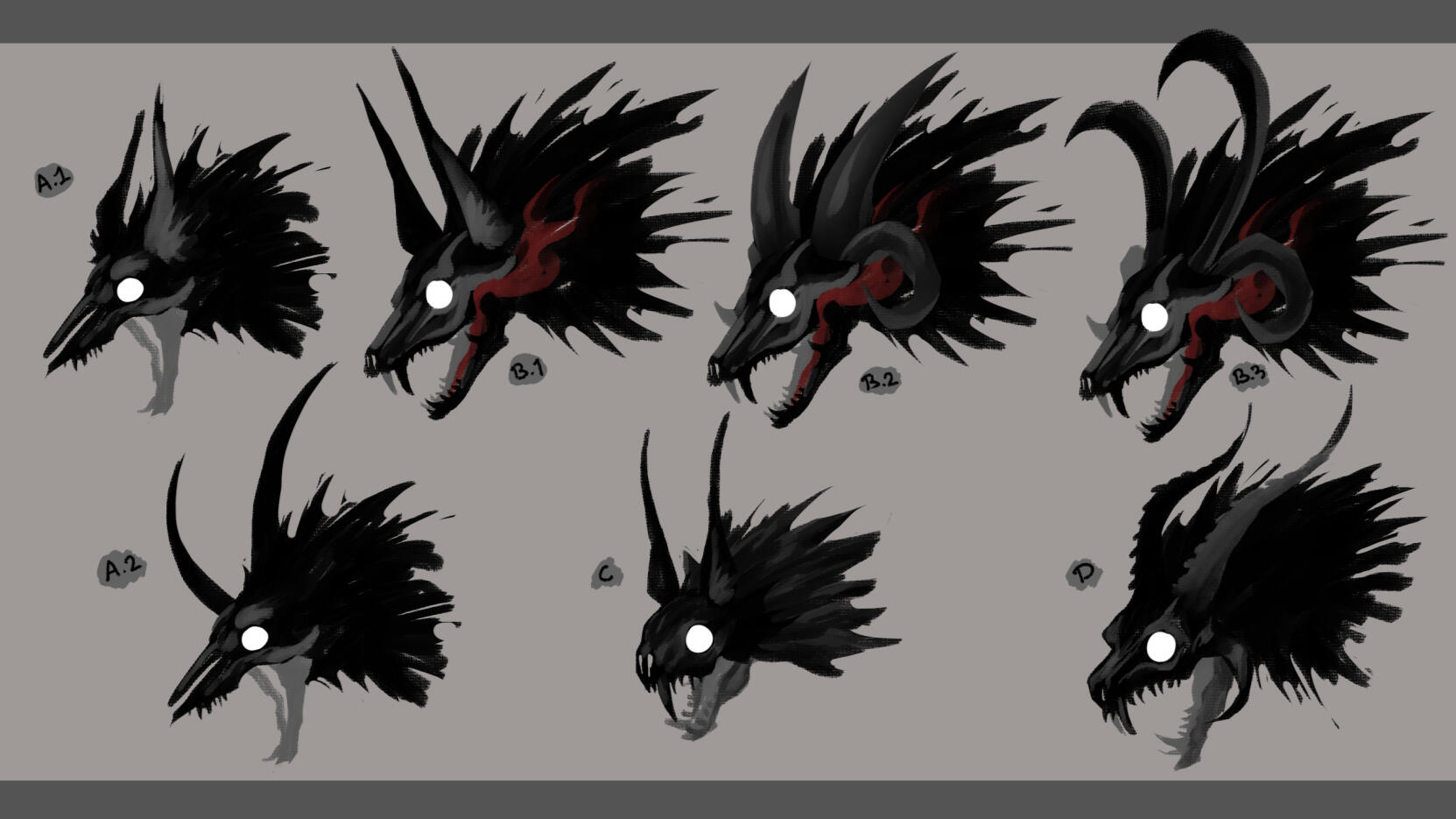
The Lore given to us by the writing department was that the Sight Beasts are citizens of Radefell who were consumed by anger.The design department communicated to us that the Sight Beast projects a cone of light from its eye(s) that act as its field of vision.With this info in mind, the main goal was to create an aggressive and intimidating creature with several eye motifs to convey the idea of the Sight Beast clearly.

I had a few concepts in mind; a brutish lumbering beast, a writhing eldritch horror, and a skittering insectoid. For each design I wanted the eyes to stand out and create a menacing presence. Something to invoke a sense of alarm when first seen to tell the player in one glance that this creature is both angry and seeking its next victim.
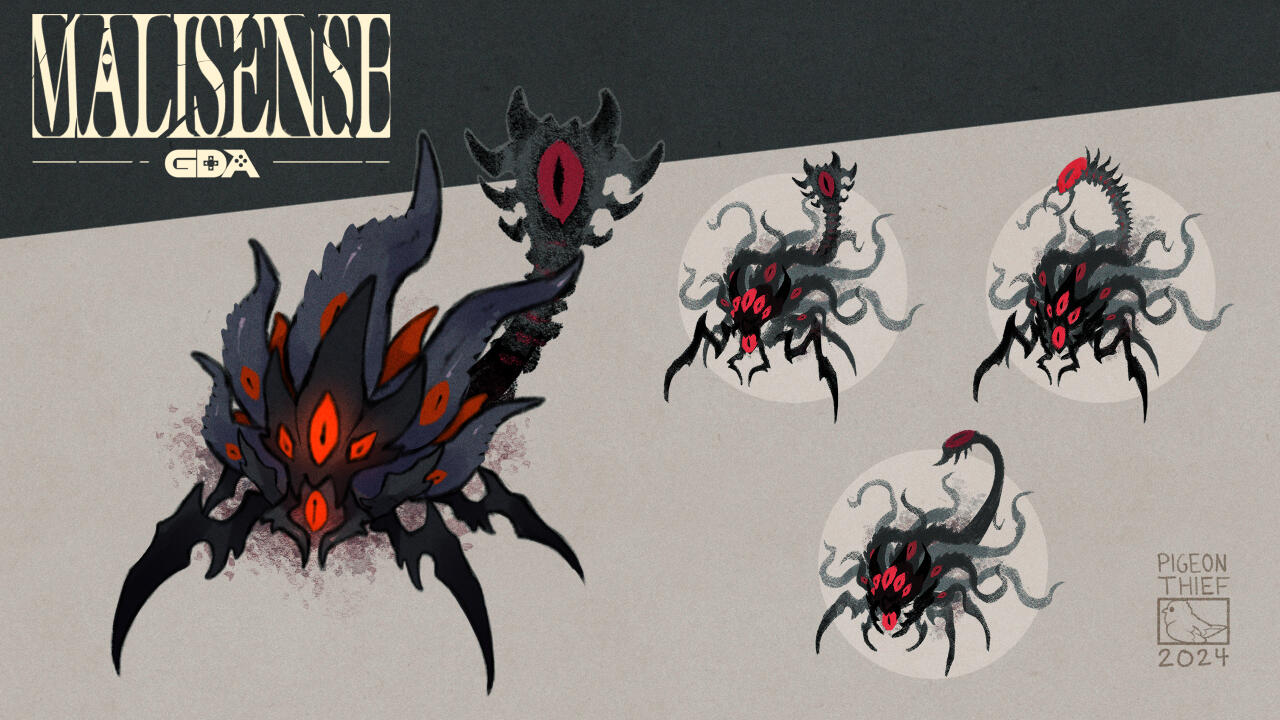
✦ Second Iteration
Collaborating with the writing and design departments, as well as the other artists on the team, we chose to refine the insectoid design as it best fit with the newest writing. Specifically, we wanted to explore more designs for the tail and headMy intent with the tail was for it to evoke a surveillance alarm that brings unease to the player. Ideally having one big eye that stands out from the rest, moving in search of prey. For the head, I wanted to brainstorm more insect-like designs, emphasizing the compound-like eyes and creating more mosquito-like legs.Along the process, there were worries that the creature being made of shadow would conflict with the theme, whereas the spider legs would match the desired emotional impact while also being easy to work with. As a result, during the refining process we experimented and expanded on the design by removing the gaseous/shadow tentacles, changing them to be more horn-like and adding more eyes to better impact the original themes.
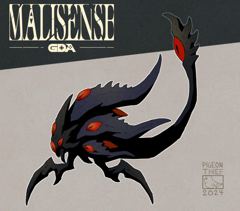
Finalization ✦
After a few retouches, the design was approved by the lead artist and I was tasked on creating the finalized asset.Because all of the enemies were set to have simple movements, there was only a need for a side-view. As a result, I had to visualize what the Sight Beast would look like from the side while capturing its complex and sharp forms.In order to maintain a cohesive style consistent with the rest of the game, I put a lot of focus on the shadows, creating sharp angles with the intent of carving out the form of the Sight beast. Many of the colors remained unaltered from the second iteration, having a black carapace and dark blue horns, contrasted by the red eyes and other highlights.
Monster Boutique
✦ ✦ ✦
Role & Contributions:
Lead Artist, Concept Artist, Character Artist, UI Designer, Programmer, Writer.
Platform:
Prototype launched on GX.games
Collaborators:
Evelyn Ware (Me), Madeline Finkel, Evelyn Ricker
Duration:
5 Weeks
Overview:
Monster Boutique is a game Prototype that I worked on in a group of 3 during my time at UCSC. I was the lead artist of the group, creating both concepts & finalized assets of the main Monster, including accessories and UI designs.The original idea started as a more basic horror game, but the idea eventually changed into a dress-up game with a gothic horror theme.
Art Project Goals:
Create a simple game themed around Queer Horror.
Create at least 1 Monster Design to be implemented in game.
Create at least 4 different sets of clothing for the monster.
Design a UI that is visually consistent with the theme of the game
Early Design Process
Early Concepts ✦
Exploration concepts back when the game idea was themed more around general horror.My main goal was to capture the image of a feral, vicious beast as I explored several designs centered around specific animals.

Early Focused Concepts ✦
In order to hone in on a design and define a clearer direction, I took a few designs that resonated with me and expanded upon them, creating a few more along the way.
Re-Design Process

Re-Design Concepts ✦
After some re-evaluation, we decided to change the theme of our project to be a monster dress-up game.Because of this, I went back to the drawing board to create new concepts that would better fit this direction.Our team was very keen on creating a bat monster, so my main goal was to create a compelling bat-design.
✦ Monster Design Process ✦
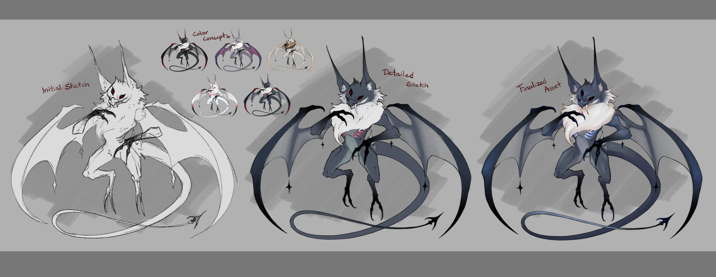
Finalized Art & Game Illustrations

✦ Bat Monster: Base Design ✦
The final illustrations I made for the game prototype.Below showcase the 4 clothing sets I made for the monster. The player is able to mix and match between all 4 sets.


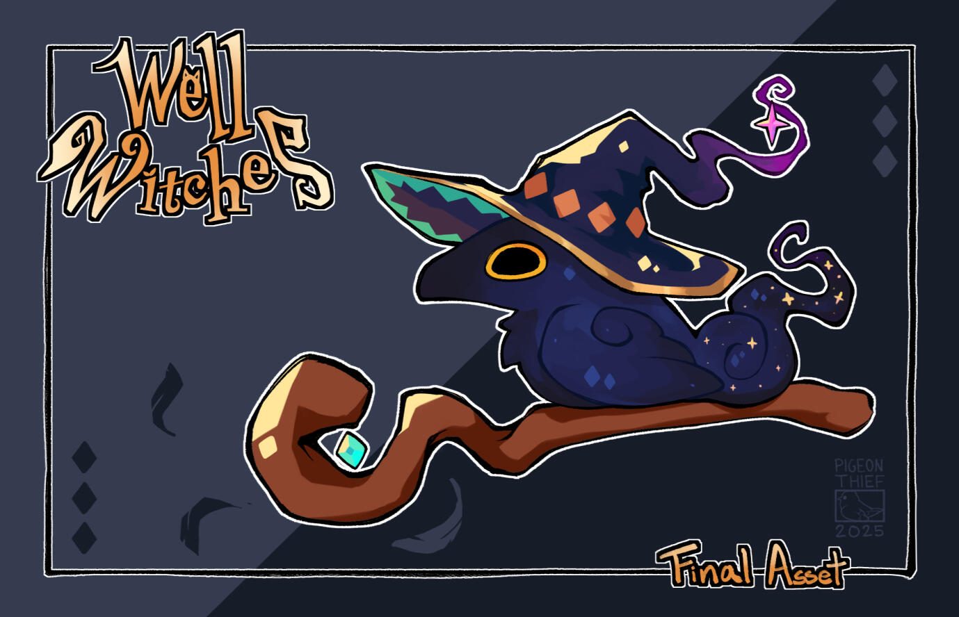
Well Witches: Raven Familiar
✦ ✦ ✦
Overview: Well Witches is a game I worked on in a large team in GDC at UCSC. I was tasked with concepting and finalizing the Raven Familiar.
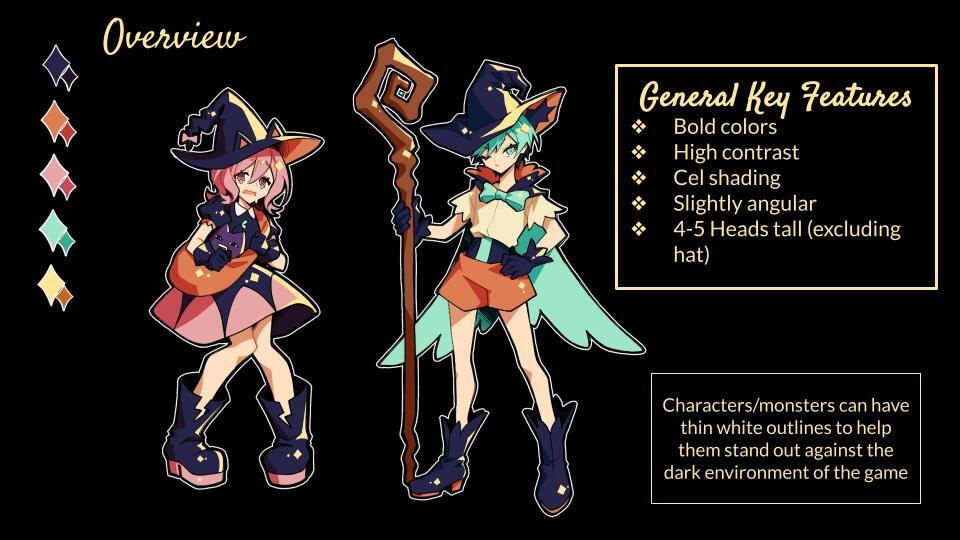
✦ Style Guide
Displayed is the style guide that the art department was given in order to guide us and achieve the desired art direction throughout this project.As seen in the image, the main objective is to use bold and saturated colors alongside contrasting colors in order to create a compelling and striking palette. When it comes to angles, lineart should be balanced; not too sharp, but not too round (with some exceptions).
Initial Concepts ✦
The Lore given to us by the writing department is that the Raven is the familiar of the Warden (one of the main characters) after forming a magical link with them.Game-wise, the purpose of this Raven is to alert the player of any changes within the area around them. This can be a new wave of enemies, a boss, etc. Its main appearance is within the UI.Due to the game's lively and cutesy theme, I decided to focus on creating concepts that would invoke amusement or delight from the player. In order to achieve this, I aimed for these birds to encapsulate silly and light-hearted personalities.
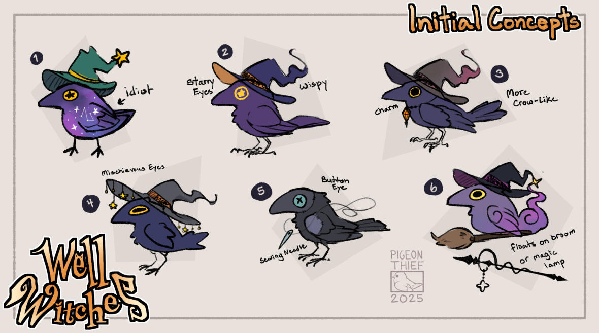
Because the game is Halloween themed and the main Characters are witches, it only made sense to also incorporate witch hats into almost all of the early concepts. Not only does it match the theme, but It also adds a bit of charm to the designs.
✦ Early Focused Exploration
After feedback from the all of the departments, the general consensus was to move forward with aspects from 1, 2, 4 and 6. More specifically, the galaxy design of 1, the wispy hat of 2, the mischievous eyes of 4, and the hat and broom of 6. With this in mind, I had a better idea of the direction I wanted to go in.


During this short time period, I decided to categorize the main aspects of the bird into 4 sections; body, wings, tails, and hats. I created a few concepts under each category with the intent to narrow down the design towards a specific direction.
✦ Middle Iterations
As the writing department updated the lore of the raven, there needed to be a few adjustments towards the art direction of the raven. This mainly meant refining the body a bit more to fit a brash and prideful personality.


Once the design of the body and head was finalized, I moved forward with refining the tail and wings of the raven.
✦ Focused Hat Concepts
After the design of the body was finalized, it was time for me to work on the 2nd most important aspect of the raven; the hat!


During the early stages of development, there was a lot of positive reactions towards the wispy hat with a balanced and curved brim. With this in mind, I created several concepts that shared those specific aspects in varying iterations.